
Idiot's Delight
〰️
Idiot's Delight 〰️
Official JCCC Theatre poster

Process
This Project was in connection with the JCCC theatre department, to design a poster advertising the play, Idiots Delight, being performed at the school.
I explored three key themes—romantic, precarious, and oblivious—through early drafts. Set before WWII, the poster aims to capture a sense of looming uncertainty balanced with a light, almost unaware tone that reflects the story.
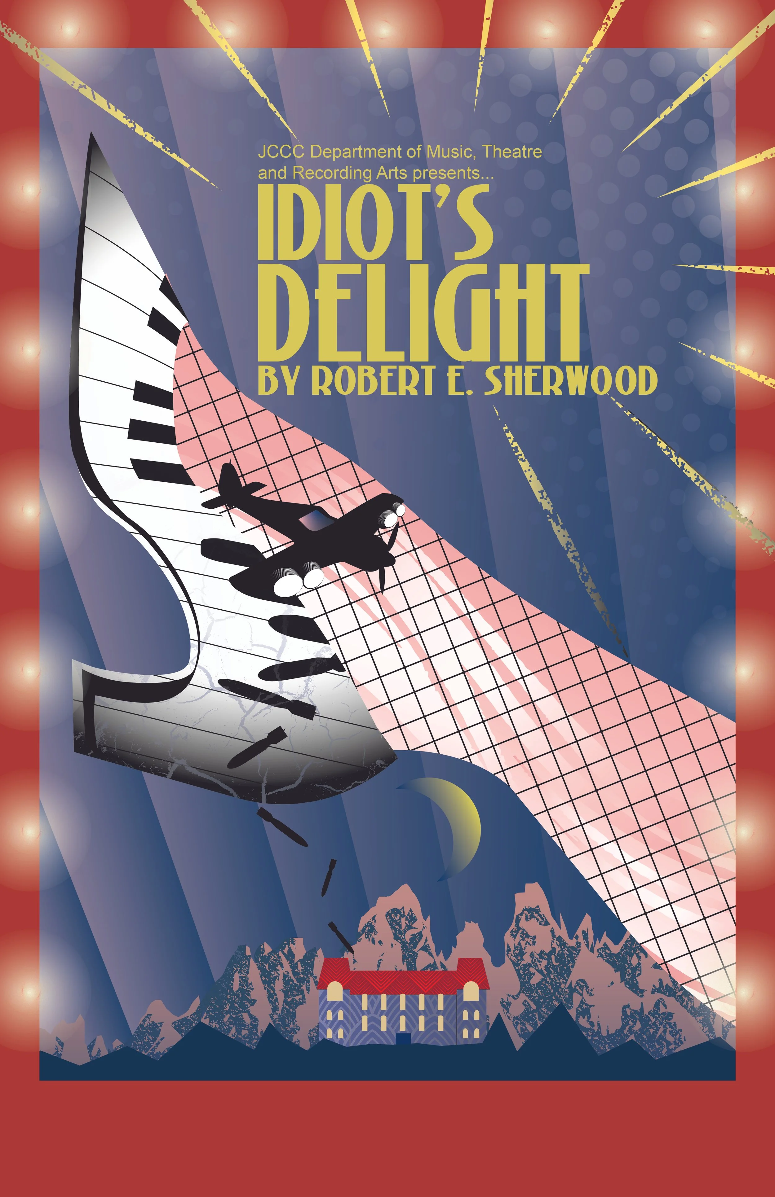
I progressed further with a more expressive color palette and an Art Deco exploration of movement and shapes. I began contacting my play director to get a sense of his opinion. With critiques, I worked on the files above to enhance the feeling I was bringing to the table. The biggest changes made along the way were the shoe tips made sharp and pointy, the play title font, layout, and the hotel that's positioned on the mountians.
Final Design
Touch Points
I’m quite happy with the progress I've made from the very beginning. Everything from the colors to the typeface had been edited and revised to be the best it could be in the time we had. I think the time and effort put into this project are clear, and I still hope to improve it in the future.
